Article: WHAT COLOURS SHOULD YOU LOOK FOR WHEN BUYING ART
WHAT COLOURS SHOULD YOU LOOK FOR WHEN BUYING ART
WHAT COLOURS SHOULD YOU LOOK FOR IN BUYING ART
A picture speaks a thousand words, and the power of the art in your home is strongly communicated by the hero colour or “palette”. Here, I break down the impact of some key colours and how they can be used in your space.
-
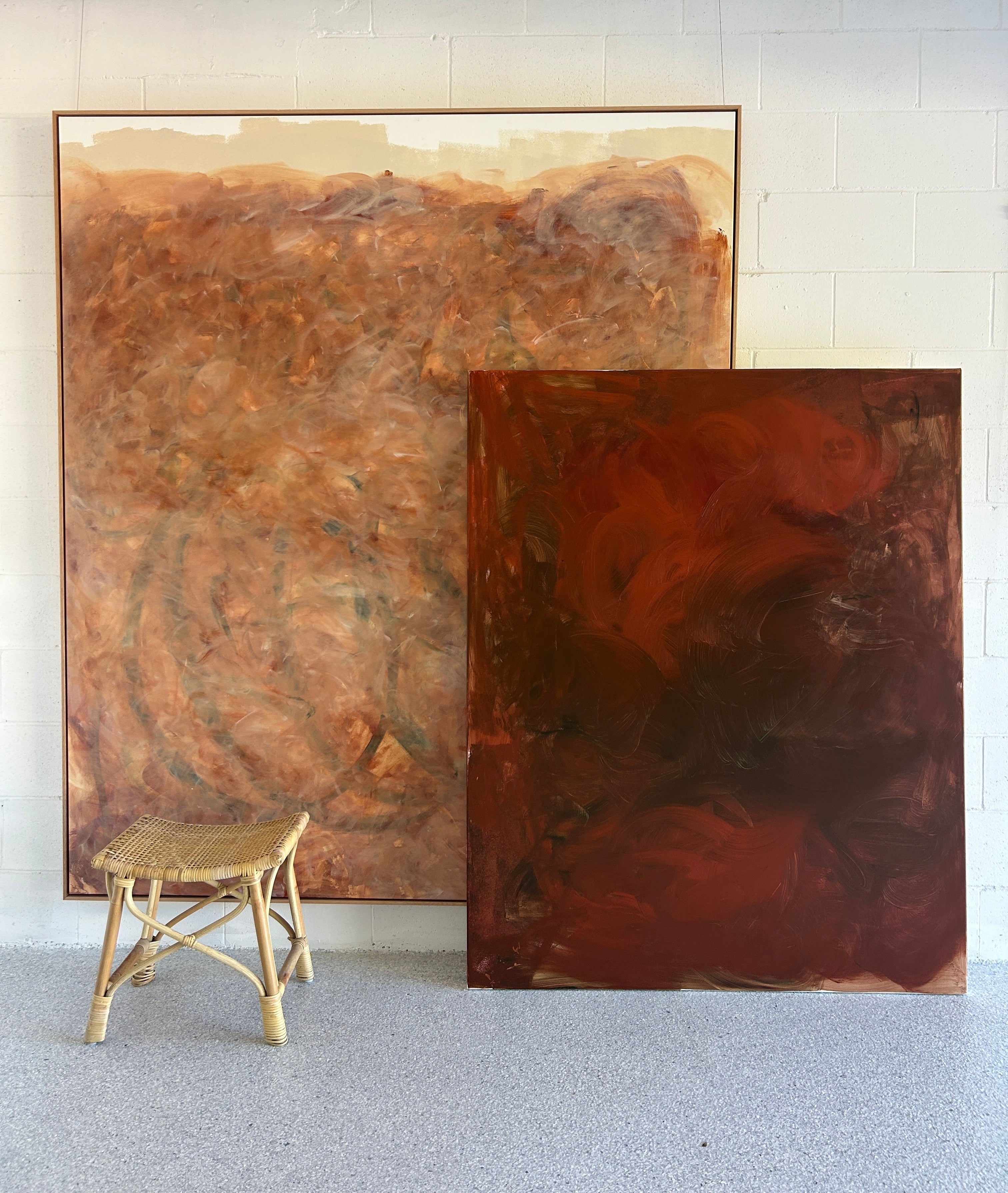
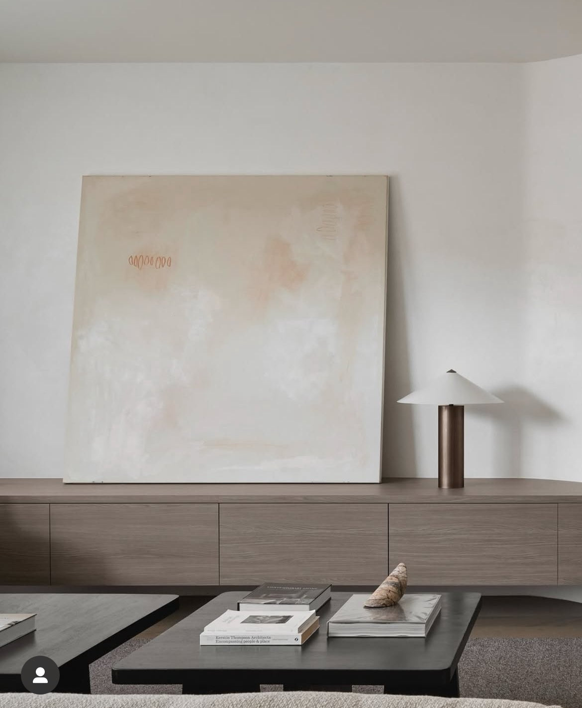
Warm neutrals - cinnamon, terracotta, latte, eggshells or whipped cream- whatever colour shade your neutrals are, they will be key to the calming nature of the artwork. Our current interior obsession with a white aesthetic lends itself to working with calm neutrals, for now and into the future, as trends shift.
-
Warm accents - chocolate, burgundy, navy and forest greens are an excellent choice for some depth and provide a great balancer to the current trends of walnut timber, oak timber, and textured wall accents.
-
Warm brights - yellow, saffron, pomegranate, sunflower and lemon sorbet- all these have a high energy vibe and can bring create a positive and uplifting vibe in a space. Look for works that include these shades to bring energy and visual interest to a room.
- Greens- so easily connected with our love our nature deep greens and emeralds will always be welcomed in interiors - we are naturally at home with this hue.
-
Black- this is an accent colour that should be considered “on purpose” a large scale black work or black framed under glass can bring a sense of sophistication. Also look for etchings and charcoal works to balance out the use of larger scale blacks.
Artworks will often have a combination of colours. Bright, bold works can be exciting and room-changing. If you are unsure how to balance the busy works consider a block colour work in the same space that have a single colour injection.
My final tip for bring a colour into your space- make sure you repeat that colour somewhere purposeful in the room- think cushions and smaller artworks or larger scale elements such as rugs or sofas.
Written by Sara Chamberlain
Leave a comment
This site is protected by hCaptcha and the hCaptcha Privacy Policy and Terms of Service apply.