WHY DO I PAINT IN NEUTRALS SO OFTEN
I have been involved in over 3000 styled homes over the years- that’s a lot of art and walls, and selections. A true challenge every home faces is how to balance out all the different walls- in a living room, you may have 3 or 4 walls and in an open plan, you will have a lot of space to fill. Whilst I love a statement piece of art, it was abundantly clear we needed a palette that was calm and easy to style with- this is where the inspiration for the large neutral works comes from.
My tips for styling with neutral artwork
-
Most base colours are a warm white - this is suitable for warm white walls and cooler whites. On a cooler white wall, the work will feel more latte and golden. If you are unsure on how warm an artwork is email me directly- ill be happy to help.
-
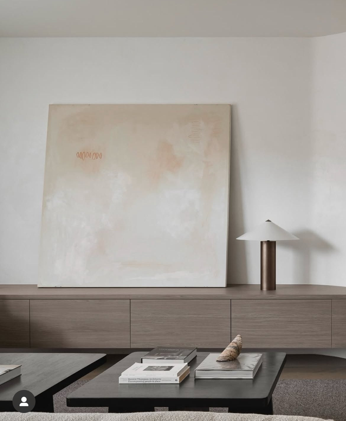
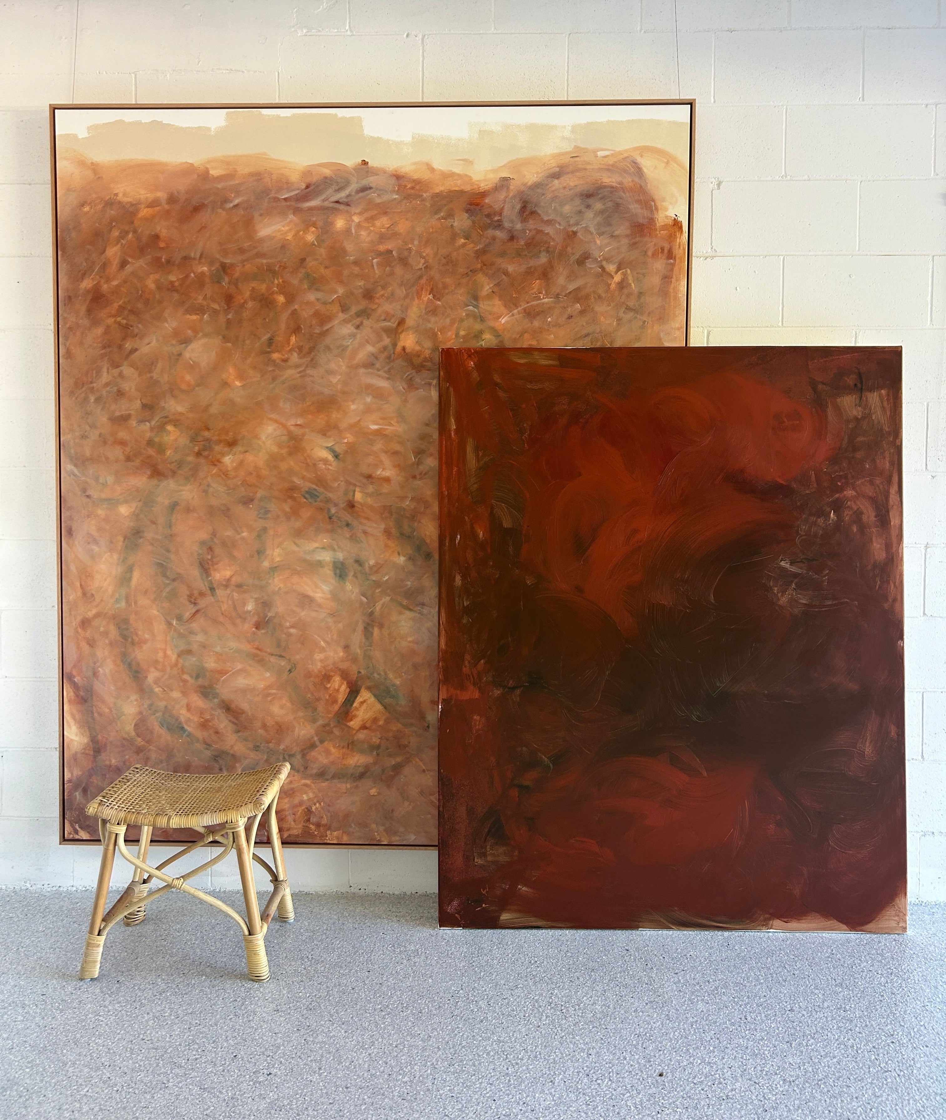
The scale is key to having an impact - the smallest neutral works I create are 1.2 x 1.2, and these ideally should be framed. Larger works can be used to balance any blank area or can be unframed or framed in oak or walnut. I wouldn't recommend a black frame on these works as the shade will make the artwork look yellow.
-
The neutral works are all painted with artist-grade acrylic and will absorb light - this will result in the works changing with light over the day- the brighter the room, the less details you will see in the work - however, as the light shifts, the shadows and complexity will reveal.
-
If you are eager to incorporate these works, look for areas in the home you would like to inject a sense of calm- my top locations
-
Entrance or welcome area of the home- enhance your space with a day spa vibe from the front door!
-
Bedrooms, including masters and nurseries - look for ways to inject a quiet use of texture and consider oversized leaning or mounted works that you can admire from bed.
-
Dining areas- often a busy hub of the home, a dining area can be chaotic and noisy. Consider adding a neutral work that can be a backdrop to family dinners, lively dinner parties and reading the Sunday papers.
Written by Sara Chamberlain
Leave a comment
This site is protected by hCaptcha and the hCaptcha Privacy Policy and Terms of Service apply.